

Without light, there is no photography. So it’s no wonder that when it comes to editing, I first start with the light. The human eye can see at least twice the dynamic range as your camera’s sensor, even the best cameras out there no where near the human eye in this regard. Add in a slight misjudgment of exposure settings that need to be corrected, or simply artistic style decisions that you wish to make, being able to successfully edit your RAW files in Lightroom for light correction is the first step in creating a finished image you are proud of. In this article I will be focusing on explaining the global adjustment tools and what they do more so than how I personally use them. The reason for this is simple – your photos are not my photos. And each of my photos requires a slightly different touch to achieve the look I personally want. Additionally there are considerations on if the Lightroom RAW adjustments are intended to be then taken into Photoshop, or if you plan for a purely Lightroom only edit. Knowing how to utilize the tools allows you to make the most of your desired workflow.
This article is going to focus primarily on Light, that is luminosity of the image. But before we begin you need to understand that you can not completely divorce color from luminosity in Lightroom editing. Modifications to light will affect the color. I intend to cover this in more detail in a future ‘Controlling Color’ article, but I will include some tips along the way here so you’re not left hanging too much. This is especially important regarding the White Balance of your image as it can have significant impact on color and exposure clipping. There’s a reason it’s at the very top of the Lightroom Basic panel.
The Histogram
We all know it, and depending on who you are, you either have embraced it or continue to avoid it. Either way, the truth is, the histogram is the only visual that will not lie to you. Think of it as the lie detector and roadmap all rolled into one for navigating the rest of Lightroom’s develop module.
Lightroom divides the Histogram into 5 sections – from left to right: Blacks, Shadows, Exposure (ie mid-tones), Highlights and Whites. Hovering your mouse over the histogram will highlight each section and show the caption on the left and a number off to the right. You’ll also notice that your mouse icon will change to a bi-directional arrow. If you’re thinking about now that you might be able to control the sliders in the Basic panel of Lightroom from here, you are correct. In fact, experimenting by left-clicking in one of the sections of the Histogram and dragging left or right is an excellent way of visually seeing what each slider does to the histogram – and your image.

The Basic Panel – Tones
In my opinion ‘Basic’ is about the worst name for this section I can imagine, but at the same time I can’t think of a better one. I would more consider this panel the ‘Foundation’ panel upon which everything else is built. And it is where you need to first decide if you plan for the edit to be purely done in Lightroom or if you are preparing the file for additional work in Photoshop. For a Lightroom only edit, you are aiming to get the image as close as possible to your desired look right there, where as in Photoshop you might be more concerned about getting every ounce of dynamic range out of the RAW file before taking it into Photoshop as a TIFF (or SmartObject, but that’s an entirely other subject).
If you’ve taken my advice and pushed and pulled on the histogram’s sections and watched the reaction of the graph, you might have started to see how each of the tone controlling sliders in the basic panel affect it and your image. However a little more detail and knowledge boost will aid in getting your images off to a good start. Starting at the top:

Exposure – Global Exposure adjustment. Think of it as a post-shot ISO slider. From your experimentation with the histogram you’ll see that it grabs pretty much the entire graph, especially the middle and slides it left or right all together. Useful if the entire image is too bright (or too dark) and you need to ‘rehome’ the base exposure. I try not to go positive on this slider more than about a 1-stop if you can help it, because like ramping up your ISO, it can expose rather nasty noise in places you don’t want it – especially in any areas that were very close to black to begin with.
Contrast – another Global adjustment, this is why it’s grouped up with Exposure at the very top. If you want to give the entire image more contrast, this is a place you can do it. Watching the histogram you’ll see it pull at both ends of the histogram and pull towards the edges – making your blacks blacker and whites whiter. In my own edits where I’m looking to preserve dynamic range, I very rarely use this slider more than a few points if at all. There are better ways in my opinion to be more targeted in how you apply contrast into your image that results in better pop of light, especially in Landscape photography. For city or street photography with different lighting conditions than we typically see in nature this might be a more useful tool, but read on for my recommendations on how to bring depth and contrast in with other sliders below.
Highlights & Shadows – Highlights and Shadows sliders effect the areas on the shoulders of your mid-tones, and are often referred to as ‘recovery’ sliders. Most often they are used as a negative number in Highlights and a positive number in shadows to recover detail in one area or the other. Looking at the Histogram as you move the sliders you will see that the graph’s movement is more of a diagonal push/pull motion. In that there is both a vertical and horizontal movement to the side of the exposure curve you are adjusting. Dropping the highlights slider into negative territory almost looks like someone ‘sat’ on the curve, where pulling up on the shadows takes the darker tones and seems to pile them up a bit closer to the middle. For both Lightroom only and Photoshop prep files, these two will help the most in giving you the dynamic range you want, especially when balancing them with either exposure, Dehaze or Tone Curve adjustments that might push either your highlights or shadows too close to clipping for your needs.
Blacks and Whites – these are the outer edges of your histogram and set where the brightest and darkest tones in your image start and end. The bookends of your dynamic range. Moving these sliders will show how these effect your histogram in a different way than the Highlights and Shadows recovery sliders. They take the very edges of the histogram and push it in a very linear-horizontal way. These are important differences when trying to get the right balance of both contrast and detail in your image to achieve the look you are after. If you are planning to take the file into Photoshop, it is vital that you do not clip any blacks or whites in Lightroom, and recover as much dynamic range as the RAW file contains. Clipping means you have met (and exceeded) the maximum value of white or black and there is ZERO detail in this area. There are two methods of viewing clipped regions. First you can hit the ‘j’ shortcut key to turn on white/black clipping warnings – which appear as either dark blue or bright red splotches in the image. Second option is to hold down the alt-key to display a clipping mask for either blacks or whites (depending on which tones are being modified) while either clicking and dragging on a region in the histogram, or on the tones sliders. This way you can quickly check your image for areas where the data is clipped.
The Basic Panel – Presence
Lightroom has been adding to this section over the last few years and giving more and more power to the user in terms of micro-contrast adjustments. Years ago in Lightroom 4 and 5, all you had to work with was the Clarity slider, which while adding contrast to the mid-tones of the image, also introduced a sharpening effect similar to a high-pass filter in Photoshop. Cranking this slider too high created nasty halos around edges, not a pretty look for most things in nature, but could create some grungy looks for street or moody portraits with it. In the latest versions of Lightroom CC we now have 3 sliders to choose from, joining Clarity is the Dehaze slider and the newest is Texture. When it comes to controlling the light, only the Dehaze slider really has much use.

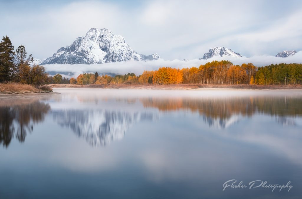
Dehaze – this slider introduces contrast in the mid-tones of your image, while affecting the darkest and lightest areas not nearly as much. Find a well exposed but relatively flat image in your Lightroom catalog and slide first the Contrast slider to the right, recenter it, and then do the same for the Dehaze slider and compare the changes. Contrast grabs both ends of the histogram and pulls like a game of tug-of-war. Your darks quickly slide towards black, and the highlights rapidly approach white, while the middle kinda squishes downward – as if the book ends had been yanked out. Dehaze on the other hand, doesn’t affect both ends of the histogram simultaneously. The far right of your histogram stays virtually in place, and depending on which way you move the slider, everything to the left moves. This means your whites and brightest highlights are locked in place, but all the contrast is mostly pushed into the mid-tones with some shadows and blacks. Likewise, moving the slider to the left, again keeps the far right of the histogram in place, while ‘draining’ contrast from the middle and darks. Tip: As mentioned above, the Dehaze slider also exist in the local adjustments in Lightroom and work especially well in foregrounds to give stronger contrast up close to boost a feel of depth, without clobbering the subtle atmospheric haze (hence the name) that give the background a sense of distance. In the image above I was able to go a little stronger on the global Dehaze because my view’s depth was measured in feet, not miles.
One more note on Dehaze before we leave the Basic panel entirely. It can saturate colors in very muted/hazy areas very very quickly as it attempts to add mid-tones contrast. This is especially noticeable in very atmospheric telephoto shots of mountains, sand dunes or salt flats. Things that are not typically all that colorful on their own can suddenly get a LOT of saturation very quickly where you don’t particularly want it. If you find that a global adjustments to this tool is being too heavy handed, using the local adjustment tools of gradient, radial or the brush might give you more control. Just remember it’s a big hammer, use it gently.
Tone Curve

First off, the Basic Panel’s Tone Adjustments are NOT the same as the Tone Curve’s. If you’ve been exchanging one for the other because you believe they are interchangeable, I challenge you to revisit that conclusion. For me THIS is where I control light to the highest degree during the RAW edit. Everything in the Basic Panel’s Tone adjustments is there to allow me to push or pull these sliders as far as I want them to in order to give the feel I want to the light of the image. And aptly named, the ‘Lights’ slider is the one where you can really turn on or off the light in the image. Once again, a picture is worth a thousand words, but doing it yourself is worth a thousand times more.

The combination of recovering highlights while boosting lights has a much stronger effect that even the maximum “positive” highlight boost.
On left is an image that has a 65 point boost to Lights and a -38 point Highlight adjustment applied. On the right is the same exact image but instead I boosted the Highlight slider to its maximum of +100 without any Lights adjustment at all. This is how I often bring light into the image’s highlights, while keeping the detail, playing these two sliders off one another. Boost the Light slider until I get the pop of light I want, then pull the Highlights recovery slider down to get details in those highlights. If I can’t get all the Light I want without over-applying Highlight recover (it can do odd things to sunsets and certain cloud formations at times) I back the Lights off some till a balance is achieved. All edits have consequences, both in terms of Mood but also technical trade-offs. Being able to recognize where those tipping points are comes primarily with practice – but rarely should a slider be pushed to its maximum.

Another example of how the Basic Tone adjustments don’t exactly lay on top of the Tone Curve panel is in the Darks Tone Curve vs Shadows Recovery comparison. On left with a strong boost in Darks applied, which resulted in the washing out of a lot of the darker mid-tones in the sky and Mt. Moran in the background. Where recovering the shadows using the Shadows Recovery slider in the basic panel to open up the treeline left the rest of the darker mid-tones of the image largely intact.
To strengthen the effect of your applied tone curve adjustments, you can select either the default ‘Linear’, ‘Medium’ or ‘Strong’ contrast tone curve points – or even go in and define a set of points of your own. I most often leave this on the linear option myself, and occasionally see what ‘Medium’ looks like. This is because I edit my files for processing in Photoshop and can get the punch of light and contrast I want for the initial global edit without changing this very often.
If you are are unsure which of the Tone Curve regions a certain area of your photo falls into, there’s a handy point selection tool in the top left of this section. I looks like a small round target. Select this and then click on your image where you want to made the adjustment. Another method for making changes to these values if you just aren’t the ‘drag the sliders’ sort of person is to click and drag in the histogram within the Tone Curves panel which acts just like the main histogram does for the Basic -Tones sliders.
The last handy, and often overlooked tool in this panel is the three sliders at the bottom of the Tone Curve Histogram. These actually allow you to relocate where along the histogram the transition between Highlights, Lights, Darks and Shadows sliders occurs. I don’t often end up using this tool, but it does come in handy at times when the Lights are reaching a little too far into the mid-tones for the application of contrast and light where you want it to live.
Putting it all together

Above is an example of how much you can control the light when all of these sliders are brought together. The original RAW file on the left slightly under exposed to begin with, but as you’ll see below, I actually lowered the overall exposure yet just a little more along with some significant highlight recovery to allow me to push a lot of Lights Tone Curve adjustment. Both Shadows and Darks were carefully balanced to open up as much of the foreground tree line as I wanted to show without washing out the entire image or having to resort to using the Blacks slider in a way that it wasn’t intended to for additional shadow recovery.

For this image, these are the settings I needed to get the look you see here from this RAW file. I could easily have gone in the other direction with the Dehaze slider, zero’ed out the slight Contrast adjustment, and reduced the boost in the Darks Tone Curve to open up the shadows in the trees yet more, and resulted in a slight more high-key / dream like / hazy look to the overall image. This is why understanding the tools, and how they interact with one another, is the key to achieving good edits on your images. An image of a vibrant sunset, strongly back-lit or a Milky Way night sky will take significantly different adjustments.
Be sure not to miss out on the upcoming ‘Controlling Color’ companion article to this one coming soon.


Want to learn more, or have a specific image or challenge you are looking to understand how to edit? I am available for one-on-one online tutorials covering a wide variety of topics of Lightroom, Photoshop as well as photography subjects related to Landscapes and Astrophotography. Make sure to subscribe for future updates and new articles, and find me on Instagram or Facebook for the latest images.
Comments
Pingback: Lightroom for Landscapes – Controlling Color | Fischer Photography