

Without light, there is no photography. So it’s no wonder that when it comes to editing, most people dive into the light first. However, light and color are tied to the hip when it comes to editing in Lightroom. Where in Photoshop you have different blend modes, such as luminosity, that helps decouple these two elements of the image, in Lightroom where one goes, the other isn’t far behind. So understanding these two parallel concepts on their own as well as how they interact is vital to your ability to create striking images.
The concept of color, both in terms of the hues being used as well as their saturation, has a huge impact on the overall feel of the final image. The topic of Color Theory is a little outside the scope of this article, but is is something that is a vital element to every color image. I highly recommend seeking out some general information about color theory so that you have a better understanding as to why certain colors look good with each other. Erin Babnik has an excellent article to get you started. For the purposes of this article, as long as you have an understanding of cool vs warm tones, the two colors that make up Tint in the White Balance slider, the definition of saturation you should be set to go. I’ll try to give context to any additional terms along the way.
It is your choice, as the artist, to decide how to mix the colors in the image to convey the look, feel and emotion you want to express. To impart a mood that goes beyond simply recording the scene but also the feeling of being there. However, without a strong understanding of how to best utilize the color tools available, meeting those artistic aims may not quite hit their mark. What I do want to focus on is giving you get a better control over color in your image using the vast number of controls available to you in Lightroom so you can apply both corrective and creative color adjustments.
One last tip before we dive into the technical details, and something for you to chew on while reading the rest of this – it is not saturation itself that the eye is drawn to, but rather contrasts in color.
The Histogram – not just for Exposure and Light!
Well all know it, and depending on who you are, you either have embraced it or continue to avoid it. Either way, the truth is, the histogram is the only visual that will not lie to you. Think of it is the lie detector and roadmap all rolled into one for navigating the rest of Lightroom’s develop module.
If you’ve read my ‘Controlling Light‘ article, you know how important this graph is to understanding what is really going on in your image. And that comes to color as well, especially in terms of White Balance. When the predominate color you see is gray, indicating the four color elements of Yellow, Blue, Magenta and Green overlap to a large degree is an indication of a relatively neutral white balance, one color does not overwhelm the others. In the Histograms below, you can see the difference in the color peaks the first vs second example. The magenta peak sitting to the right of the green peak is an indication of a magenta color cast in the image.

White Balance with a heavy Magenta cast 
A more neutral White Balance
White Balance
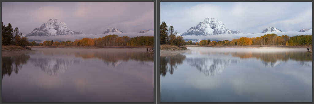
The image was taken in some challenging pre-dawn overcast conditions, resulting in Auto White Balance making poor choices.
Adobe engineers, overall, did a really great job of organizing Lightroom’s controls and panels in my opinion, so it should come as no surprise that White Balance is right at the top of the stack. Getting this set correctly right off the bat is vital to being able to make good decisions about light, exposure and all the other color decisions to come about your image. It is always a primary driving factor in the overall mood of your image as well. The eye is drawn to warm tones, especially when placed next to cooler tones. In the example above the tree line stands out much more in the adjusted image because of the contrast between the cool tones in the sky and mountains against the ribbon of warm autumn aspen leaves, compared to the before where the magenta cast overwhelmed the entire image, obscuring the color separation.
The White Balance controls in Lightroom are comprised of two sets opposing colors. First is Temperature – cool tones to warm tones. If you are shooting in RAW (and of course you should be) this scale is displayed in degrees of Kelvin. The larger the number the cooler the color temperature. Second is Tint – greens vs magenta, and will always be displayed in a positive (for magenta based adjustment) or negative (for pushing the tint towards green.


Compare the histogram above on the left against the one in the Histogram section. Both have blue peaks on the far right of the histogram, but one is an indication of an overall cool color cast where the other indicates large region of the image is predominately blue in color – that could be a rich blue sky the hazy distance horizon of a seascape that is reflecting ocean colors, etc. Learning to detect one situation from another takes some practice and experience reviewing your histograms on images that you process. On the first example you’ll see there is a lot less gray overlap and the yellow and blue sections are offset from one another, as well as a big red/magenta spike to the right of a green spike. This shows there is a significant unbalance of both Temperature (too much cool tone) and Tint (too much magenta) in the first example. The second Histogram is from the image that does have a large section of predominately bright blue tones on the horizon, as noted by the big spike on the far right, but the rest of the histogram is largely in sync and thus a neutral overall balance.
The far right image shows two of the tools that Lightroom has built in to help get you ‘in the ball park’ for what you want. On the left is the eye-dropper tool. Select this and then pick somewhere in your image that should be neutral-gray in color (note – you’ll want a color that’s in the mid-tones or darker, really bright colors often don’t work for this). The other automatic option is to choose one of the pre-set White Balance options that most closely matches the conditions you were in at the time the photo was taken. ‘Auto’ is directing Lightroom to take it’s own stab at what it thinks the ideal White Balance is, and will likely land you in a rather neutral territory. The ‘As Shot’ option resets the image to how it came in from your camera.
If you know what sorts of conditions you are shooting in, or have a personal preference for warmer or cooler tones in your images, you can take more of the control away from your camera by setting your White Balance to something other than Auto in camera. Most DSLR and advance point and shoot cameras – as well as many phone cameras have preset White Balance settings, or even an option to set a specific kelvin color temperature based on the shooting conditions. Lightroom also has the option to apply presets during import, a place you can also define a specific White Balance choice for the entire set. These steps may cut down on time spent getting your White Balance dialed in especially in big sets of images taken under the same conditions, but you also need to remember you have those settings enabled when you go from one shooting condition. It’s for this reason I usually leave my cameras in Auto White Balance and make the adjustments at the time of edit.
Saturation vs Vibrance and Vibrance vs Saturation
These are your two global volume knobs for color, and the difference between the two are important for making the best color corrections for the situation you are working with and the results you want. Like light, saturation has a maximum value before it can no longer get any stronger. This causes clipping, a region of your image loses color detail. Over saturation of an image also reduces the color contrast, making everything – and thus nothing – stand out, and drawing attention to areas you really don’t want the eye to be drawn to.

Saturation is a linear control. Meaning it turns up all the colors in your image at the same rate. It’s a ‘everything gets an equal weight’ sort of slider. It’s also a really good way to make colors clip if you’re not careful, turning a nicely graduated set of colors into a big blob of a single maxed out color. This is especially the case with reds that can often be highly saturated to begin with – think of a field of red flowers or sunset.
Vibrance on the other hand, and in my opinion the reason it’s placed above saturation, is that it’s placed above saturation is that it favors the under saturated colors first. Use this slider to put colors on a more even footing – if that’s what you are looking to do. Remember what I said up above – it’s the contrasts in color rather than saturation itself that the eye is drawn to. If you put every color on the same footing – same saturation level – especially if it’s all turned up to 11 – it’s just a lot of colors yelling at the viewer. That’s not much better than cranking the saturation across the board and resulting in clipped out areas.
My current workflow is that I usually give a mild boost to Vibrance, since often subtle colors are washed out in RAW files, but then, especially when paired with adjustments in some of the other panels lower down, I make a slight decrease in global saturation so colors are not clipped. When starting with an edit, I’ll usually boost Vibrance by around 15-20pts, and drop the Saturation around 5-10. This usually keeps me from getting too close to ‘eye bleed’ territory as I work with the rest of the color controls, contrast and tones.
A little tip, if you want to see where the most saturated colors and areas of your photo are, drop the Vibrance slider all the way down. You’ll end up with a largely monochrome image, but with a few hints of color still present. If this color isn’t in your subject or close to the edges of your image, it’s likely going to cause an imbalance with the flow of your image that you are trying to achieve.

HSL – Hue, Saturation, Luminance

Hue, Saturation and Luminance allows you to fine tune your image by individual color ranges. When it comes to nature and landscape photography especially, I recommend starting any adjustment you wish to make in these sliders by using the targeted adjustment tools in the upper left corner of each panel (next to the red mark in the image above). This tool adjusts the sliders by how much of that color makes up the hue under the cursor. Take a color that is a deep red-orange, consisting of both orange and red. The targeted adjustment tool will move both sliders together rather than just the red or the orange. This helps prevent color banding in skies and other areas where there is a gradual transition of colors. However pushing any one of these sliders too far in relation to the adjacent sliders will likely result in color artifacts you don’t want. The targeted adjustment also helps in situations where you think you want to adjust the greens for some foliage, but the color is actually a slightly green-ish yellow.
Hue – This more than any of the others has the potential for bad results if you don’t use the targeted adjustment tool. It pushes colors one direction or another towards its neighboring color. This is extremely useful if you want to make an image’s colors more harmonious (being very similar to one another), or if you’re trying to achieve a stronger complimentary color set (directly opposite each other on the color wheel such as blue and yellow, or green and red). Harmonious colors can be desired for pieces that you intend to have printed where too many competing hues of the same color can make coordinating with the rest of the space difficult.

Saturation – this lets you control the global saturation of a single color across the image. Want the yellows in a sunset or a patch of flowers to pop a little more, or the green leaves around them not be quite so in your face? This is a good place to make subtle changes that can help make the subjects of your image shine as well as making sure no one color becomes too ‘over cooked’. There is one modification in the HSL Saturation section that I make to nearly all of my grand landscapes – reducing the Blues by at least 8-10 points. After reviewing hundreds of my own images as well as critiquing those of many other photographers I’ve found that one of the fastest ways to pull a viewer out of reality is for the sky – especially if it’s not a perfect blue sky in Montana – to be heavily saturated. Also, since the sky, especially if it’s a plain-Jane blue sky, probably isn’t the most interesting part of your image, it should not be the most saturated color.

Luminance – in conjunction with saturation, luminace are ideal to help draw attention to or away from colors to strengthen the color palette you want to have within the image. You may need that color to exist because it’s not realistic to change it to a more harmonious color with the rest of the image, but you can darken it along with desaturate it to keep it from being a focal point. In the image below of Soco Falls in South Carolina, not all of the leaves around the top of the falls had changed yet, resulting in a mix of greens and golds throughout the foliage. One of the ways I kept the green hues from upsetting the complimentary color set of the golden trees on right and the cool blues in the water on right was to reduce the luminance of the greens (along with pushing them slightly towards yellow and desaturating them in the other sections of the HSL panel). Some images are more difficult than others to leverage the Luminance slider, depending on how many different elements share the same color ranges. In these more challenging situations where the global HSL Luminance sliders won’t give you the control you need, you may need to employ some of Lightroom’s local adjustment tools which I will cover in an upcoming article.

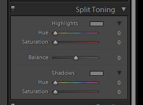
Split Toning
This is one of the ways you can introduce a ‘non-original’ color into an image, and for landscape images such as what I focus on, I use this panel relatively infrequently as I prefer to work with the colors original to the image, or ones introduced by either a White Balance or Hue adjustment. The basis of this panel is that you can chose a color to add into the shadows, and a color you can add into the highlights, and in the middle you have a Balance slider that controls how much of the image one color or the other can reach into.
If you are doing a Lightroom only edit, and you want to give your image a more artistic touch, this might be something you can look at experimenting with to give your photo an overall color theme/style. However I often find the effects are not very natural looking for most images. Generally starting with an image that is already very desaturated (or converted to a monochrome) to create a dual-toned monochrome edits has been the most successful use that I have found. When using this tool, I highly recommend starting with fairly desaturated colors, no more than 15% or so, stay within the colors that nature would create. Meaning typically cooler colors work on the shadows and warmer colors work in the highlights. In the example below I started with an image from the sand dunes in Death Valley and in conjunction with some contrast and light adjustments added a split toning to create more depth and dimension to the highlights and shadows.

Calibration / Camera Calibration
Calibration, or as it used to be called ‘Camera Calibration’ in some older versions of Lightroom is often overlooked by newer users of the software, especially since it is placed at the very bottom of the stack. Most people get their images looking good using all the tools further up and by the time they reach Calibration they feel it’s not a needed step. I know I didn’t touch it for quite some time as I had little clue as to how it worked. However with a little knowledge and some experimentation you can unlock an extremely powerful tool for targeted saturation and hue modification for a variety of uses.

The color in your images are comprised of three channels: Red, Green and Blue (RGB), how much of each of these three channels exist in each pixel determines the actual color displayed. Google has a handy Color Picker tool that can help visualize this by looking at the RGB numbers as you drag either the cursor within the color picker window or the hue slider below it.
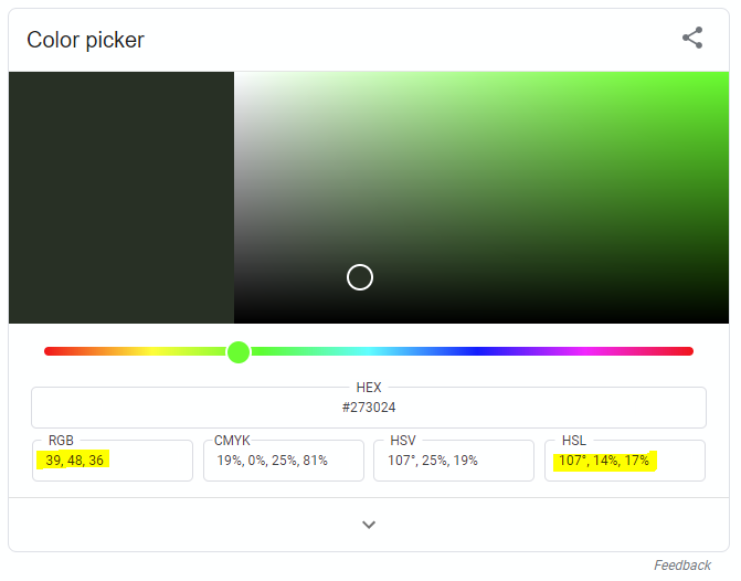
In this color picker, pure red is 255, 0, 0; pure green is 0, 255, 0 and pure blue is 0, 0, 255. Black is represented as 0, 0, 0 and white is 255, 255, 255. Every other color is some mix of the three. For example pure Yellow would be 255, 255, 0, where the dark muted green in the screen shot is 39, 48 and 36. So from this you can see that the higher the number the more saturated that channel is.
Back in Lightroom, we have the same three channels – Red, Green and Blue and we can either modify the hue or saturation of it. Modifying the Hue makes the channel represent a color slightly different than normal. For example dragging the Red channel’s Hue slider to the right will make that channel a ‘Red-Orange’ channel where going to the left will make it a ‘Purple-Red’ channel. The effects of changing what the channel represents in creating the color of your image can have significant, and often unnatural effects. Much more useful in nature and landscape photo editing is the Saturation sliders of each channel. This boosts the saturation (the 0 to 255) of that channel. Colors in your image that comprise a larger percentage of the channel you boosted will saturate faster than colors that have little or none of that channel creating the current color.
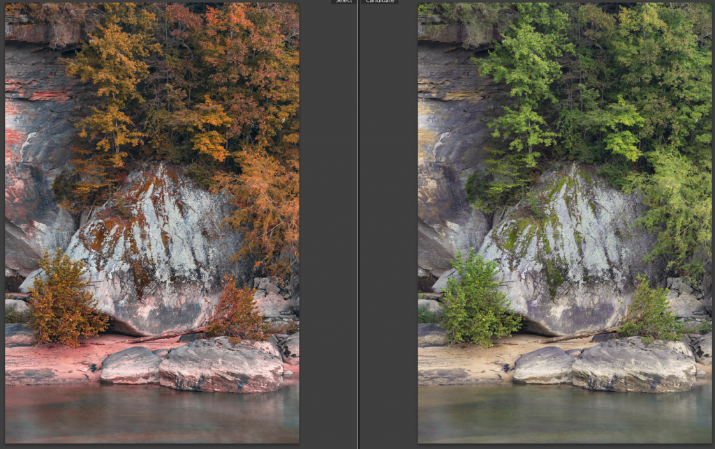
How much of each channel that I personally use has evolved quite a bit over time, and depends heavily on the type of image and the intended look. The strong boost to each channel shown in the screen shot at the top of this section was taken from an abstract close up of a rock covered in mosses and algae that could take a big saturation boost across the board. These days I usually either only work with a moderate boost Red channel and/or Blue Channels. I often leave the Green channel alone as it often does not do much for the colors I’m looking to bring to the forefront. This really is one of those cases where I recommend you ‘try it at home’ with a variety of images and see what each does.
Recall earlier when I mention that almost all of my photos include a reduction in the HSL Blue color saturation. This is the big reason why, I can easily create far too saturated blue skies (or water, etc) by boosting the Blue channel here in Calibration enough to effect other colors to the degree that I want them. If you do have that big bold blue sky in an image – even a moderate boost to that Blue channel is going to make it really saturated and unnatural.
Another effect of working with the Calibration Saturation (and sometimes minor adjustments to the Hue) is an increase in the variations of the colors themselves throughout the image. Go back to the Google Color Picker and slowly drag the hue slider and watch the RGB values carefully. You’ll see that depending on the color, each of the three numbers change at different rates (or one may not change at all). If you have two similar colors in your image and you boost one channel, leaving the other two in place, each color throughout the image will be effect to a different degree. However unlike working with the HSL hue sliders, there is less risk of ‘ripping’ a color apart and creating banding in smooth transitions. This additional color variation can create the appearance of richer colors and more detail and depth.

The two examples above are how to use, and not to use, the Calibration controls. The first shot shows a lot of rich colors with a lot of variety. A different saturation increase than if I had just turned up the saturation slider, or even employed just the vibrance slider thanks to each channel getting a different increase. This is the result of the calibration adjustments seen in the screen shot up at the top of this section where there are lower saturation boost in the Green channel vs the Red and Blue channels. In the second example where I worked with the Hue sliders a bunch, in a vein attempt to transform the green foliage into fall colors. Not only did it not get me to the foliage colors I wanted, but also made other parts of the image turn quite ‘radioactive’. A great example of why the hue slighter needs to be treated with a very light touch.
Putting it all together
For my landscape photography, when working with the colors, I work in this order: 1) White Balance, 2) initial-baseline Vibrance/Saturation settings, 3) Calibration adjustments, 4) HSL adjustments 5) fine tuning of the previous steps either during or after getting the Light and Tones corrected. Since most of my images also end up in Photoshop for the final editing changes, I will often dual-process my images. This allows me to tailor a set of global adjustments in Lightroom to different parts of the image – be it darks vs lights, foreground vs background. To do this I make my first round of edits including all of the Light and Tone adjustments and then make a ‘Virtual Copy’ (right click on the image in the Develop panel to bring up the context menu, or find it under the Photo menu at the top of Lightroom) of the file in Lightroom, making additional adjustments to get another part of the image the way I need it, and then blending the two together in Photoshop using a mask. If your workflow is purely within Lightroom, understanding each of the color tools is even more important to getting the most out of your image without going through the additional selective blending and adjustments in Photoshop.

Each photo is different, and thus the challenges and solutions are too. This is why I stress an understanding of how each tool works more than how to use them in a specific situation. Together with Controlling the Light of your image, understanding how to control color will go a long way to helping you achieve style that you want to achieve in your work. Getting a sound grasp of color and tone interaction in Lightroom’s tools comes primarily with practice and will also provide a strong foundation for eventually moving into Photoshop’s even wider array of tools.


Blue Agave – Sedona – 22mm (full frame)
Want to learn more, or have a specific image or challenge you are looking to understand how to edit? I am available for one-on-one online tutorials covering a wide variety of topics of Lightroom, Photoshop as well as photography subjects related to Landscapes and Astrophotography. Also don’t forget to subscribe for future updates and new articles.
Comments
Though I seldom have the opportunity to do landscape photography, I found your explanations of using Lightroom to be excellent. I prefer LR to do most of my editing and you made it all much more clear to me. Previously much of my learning has been through trial and error. And as always… your photos are gorgeous!